


In 2018, a trend was identified in branding and logo design within the fashion industry. The phenomenon was called “reblanding” (sometimes mentioned simply as “blanding”) and referred to the perceived oversimplification of logos and visual brand elements. Companies like Balmain, Yves Saint Laurent, and Burberry had all undergone a rebranding of their primary visual identity that some customers and critics called “bland.” Gone were the detailed wordmarks, serifs, and custom lettering of their previous logos, replaced by typefaces that seemed born from the Helvetica style of font design: bold and clean but utilitarian.
While the practice of reduction and minimalism in branding wasn’t new, the trend of leaning into this ultra-minimalist style and the resulting familiarity that every fashion brand at the time seemed to embody was unique to a few years around 2018. While reblanding was the technique of choice in fashion, it soon also became noticeable beyond the runways.
In recent years, brands like Sears, Eddie Bauer, Staples, and Johnson & Johnson have taken a similar approach with their logos, pivoting away from inline lettering, cursive hand-written styles, custom letter shapes, and distinctive iconography in favor of sans-serif fonts and minimalist graphics.

Today, despite many predictions that this was a design trend that would die off, most of these brands have retained their reblanded look and more companies have joined in on this minimalist trend.
The term “reblanding” sounds like a bad thing, turning once unique and visually interesting logos into bland lifeless marks without any soul or character. But is it really all bad? Or is there a strategic creative advantage to embracing this style of minimalist type as part of a simplified primary visual identity?
Let’s explore some of the key attributes of reblanding and how it can help brands elevate their visual identity systems.
Legibility
One of the most frequently referenced motivations for companies to take a minimalist approach in their logo design is to improve the legibility of the brand name. Part of this is certainly a generational shift, with younger audiences having limited exposure to cursive writing in school and producing more classroom work on a computer where script fonts are less appropriate.
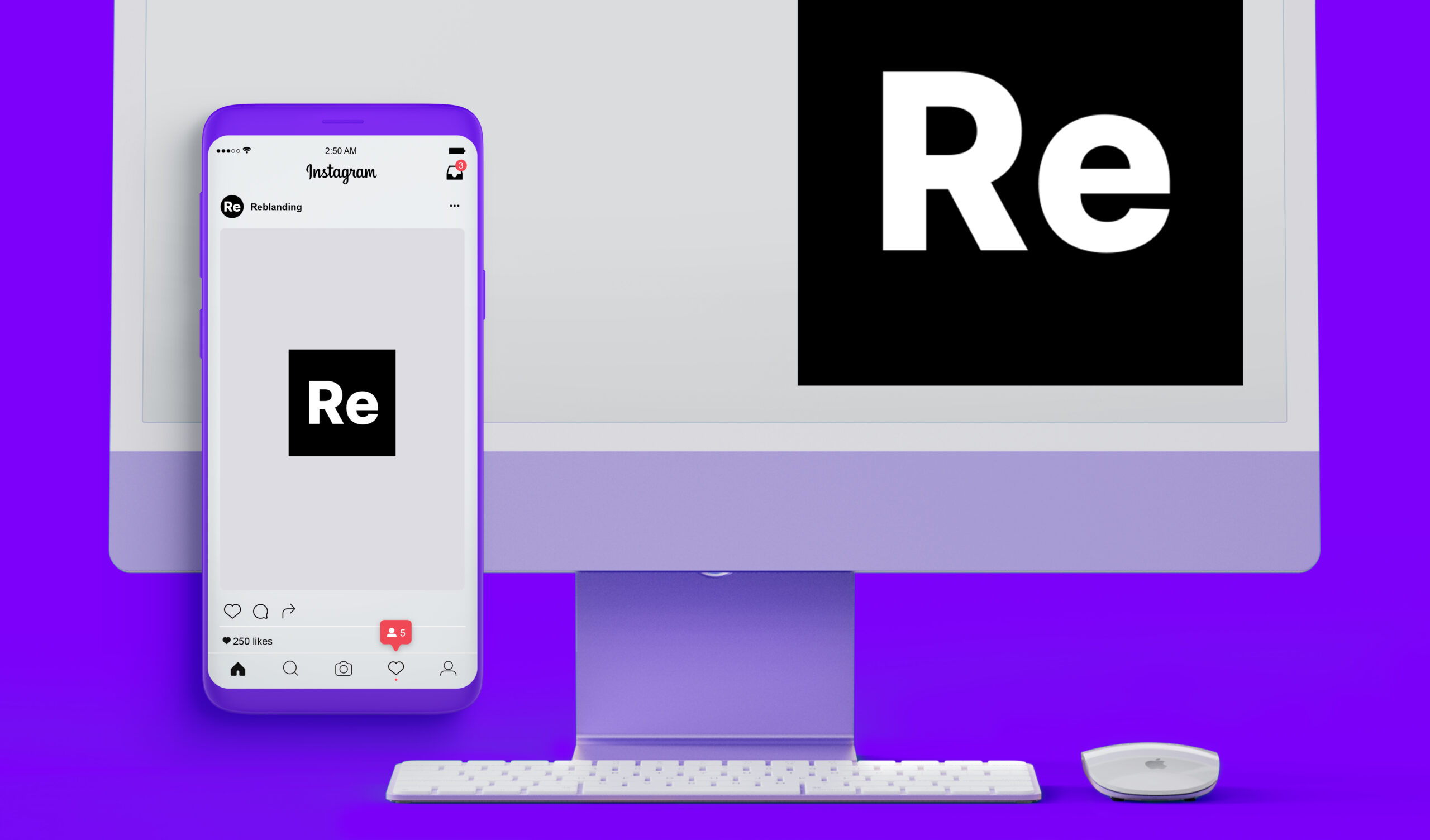
There is also another tech angle to this strategy: making logos and brand marks easier to identify quickly in a digital and social age where advertising and marketing messages are scrolling rapidly before our eyes on our phones and computer screens. When web browser statistics showed mobile devices overtaking desktop screens as the more commonly used devices for viewing web content, brands reprioritized a mobile-first approach to their entire brand system, including logo design.
Familiarity
Possibly, an unintended effect of several brands in the fashion world switching to very similar minimalist logo designs made them seem more familiar. Although brands usually strive to be distinct and stand out, being familiar isn’t bad when it leads to recognizability. You are more likely to view the brand favorably if a logo design instantly feels like something you know or have interacted with before.
Consumers have a comfort zone when it comes to brand interactions, and working within that zone with type styles and font choices that feel safe and familiar builds up those comfortable feelings.
Utility
A bold wordmark in a clean, minimalist font will be easy to use in any situation, over any color, black or white backgrounds, large or small, and even over textured or busy imagery. Thin wordmarks, delicate fonts, or complex letter shapes will be a challenge to read in some use cases, in particular when used over detailed photos or complex illustrated backgrounds.
Social media managers often need to combine photography and branding into one post image, so having a logo design that more easily integrates into all visuals keeps the primary brand mark clear and readable in situations where thin and ornate logos struggle to stand out.
Reproduction
While printing and manufacturing techniques are more capable than ever of handling almost any challenge that a complex logo design might present, having a simplified design makes any physical reproduction of the logo a far easier process and opens the door to even more advanced effects and materials.
For a brand like Eddie Bauer, which relies heavily on embroidery, or Johnson & Johnson who often place their logo on small products, minimalist logo design helps to ensure that the logo will be clear and readable on every product.
A Mark for Change
Reblanding in logo design typically means a significant departure from a previous design, going from detailed, complex, and ornate to the complete opposite; clean, simple, and minimal.
Companies can use a dramatic change like a streamlined logo to signal a strategic shift, realigning their brand with different values, marking a pivot to introduce new services and products, or entering new markets.
Bland Isn’t Always Best
Reblanding won’t work for everyone. In fact, one of the brands mentioned earlier in this article has since reverted to a more stylized logo. After a few years of using a reblanded design, Burberry returned to its pre-2018 mark featuring a knight on horseback and paired it with a serif font with more distinct letterforms.

For some brands, though, reducing the complexity of the logo in favor of expanding the visual identity system can open up new opportunities to express what the brand is all about without relying on the logo to say everything.
In this mobile-first, fast-scrolling era where people view brands quickly, often on smaller screens, positioning your logo to be clear and bold can capture that elusive instant brand recognition while leaning on the rest of the system to tell the brand story.
Reblanding may sound like a term that is inherently critical of the resulting “blanded” designs. Still, it is simply a modern reflection of what has always been true about logo design. Creating compelling logos is a process of simplifying things as much as possible until taking anything else out of it hurts the design.
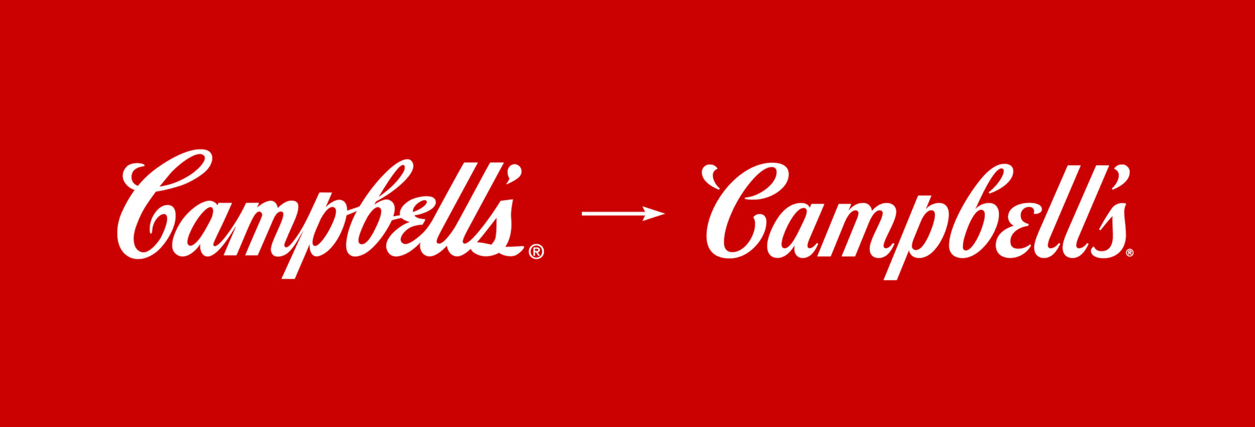
Some recent rebranding efforts, like the Campbell’s Soup company logo update, have successfully simplified a design without removing too much of the character that made the logo distinct in the first place. This approach may be the best way forward for checking those boxes on legibility, familiarity, and utility while keeping some of the visual identity consumers have come to know and love about their favorite brands.
Although logo simplification is still trending, the identity systems that these streamlined logos fit into are actually becoming more complex. Brands sometimes require a responsive logo design system that includes additional design variants to fit the growing list of display use cases, from small avatars and icons to large display options. The identity system we created for AllShifts is a good example of this approach.

Conclusion
Proven logo design wisdom hasn’t changed all that much over the years. The branding world is simply experimenting with how far we can push this philosophy while grappling with an ever-changing landscape and new platforms for showcasing these brands. Reblanding is the natural evolution of a creative and strategic process that has to consider technical challenges in an increasingly mobile-first world, alongside consumer sentiment that makes change a sometimes tricky idea to get everyone on board with.
Here at Ridge Marketing, we expect visual identity systems to continue to grow and evolve to meet the expanding needs of a modern brand ecosystem. While the specifics of what that entails may change over time, the consistent factor here will continue to be that brands need to continue to evolve to remain relevant.
If your organization is due for a rebrand and wants to avoid being bland, please reach out to us.