


With the recent rise in public concern over blue-light exposure, extended screen time and accessibility on smaller devices, many of the major players, including Amazon, Microsoft and Google Chrome, recently switched their platforms over to a “dark mode” interface. Also commonly referred to as “dark theme” or “night mode,” this design aesthetic features a light-on-dark display, deploying lighter fonts on black backgrounds.
It’s unclear (and a point of contention) how dark mode originally began. Twitter started experimenting with a light-on-dark color scheme for Android phones in 2016, but Apple’s 2018 iOS Mohave update ultimately brought dark mode to the mainstream.
Historically, dark mode has been around even longer than that. Before it was trendy, designers and developers may remember old-school editing software and code builders (which required a neutral-colored background) used a very early form of dark mode. By the mid-2000s, however, backlit LCD screens (which were light by default) became the norm in laptop and desktop displays. The monochrome monitors of days past felt passé compared to the beautiful, addictive full-color screens of modern-day computers.

4 REASONS WHY DARK MODE IS TRENDING
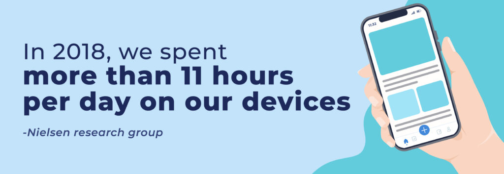
Having screens 24-7 in the palm of our hands changed everything. According to the Nielsen research group, in 2018 we spent more than 11 hours per day on our devices. Of that, 62% was app/web browsing on smartphones. That adds up to a lot of time in front of bright, white rectangles!
- Easy on the eyes. User interface designers at Twitter and Reddit concluded that dark mode is gentler on your eyes than the traditional interface of black-on-white. It also helps that low-light conditions can keep user retention and encourage users to stay on your app or website longer. Ultimately, the effectiveness of dark mode for eyestrain relief is still up for debate since looking at a screen can vary widely based on your surroundings.
- Dark mode helps with legibility. Regarding content readability, ensuring higher contrast and legibility between text and background is more important than color schemes. While people claim that reading white text on black backgrounds tends to be easier (and that dark mode for reading is superior), studies have found that we read better and more accurately when the text is black on white backgrounds. This might be one of the keys to why people spend longer on these apps and websites when dark mode is enabled – because it reduces legibility and makes reading more effortful.
- Dark mode is simply more beautiful. A huge driver of the acceptance of dark mode may be for aesthetic reasons. After decades of white, bright screens, dark mode creates a sharp, dramatic aesthetic with a feeling of luxury and prestige with its simplified palette and sleek design. A brand can quickly switch the overall perception of their “mood” by switching to dark mode.
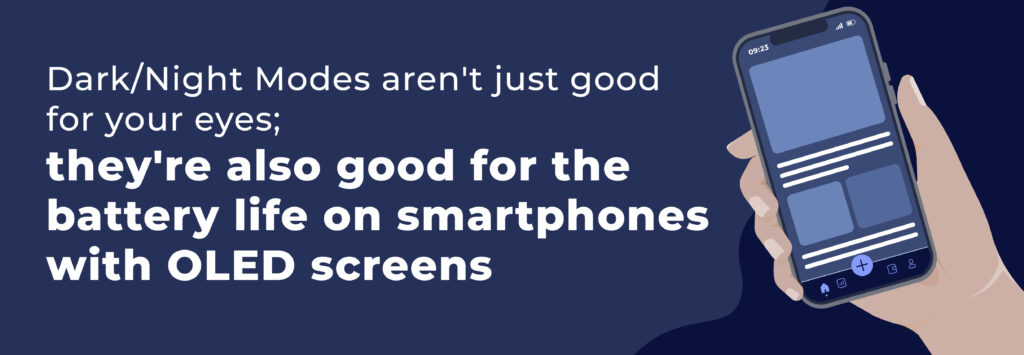
- It saves on battery life. Another claim is that dark mode can help extend the battery life of your smartphone and other devices. This is true in some but not all cases. Beginning with the iPhone X, phones began launching with an OLED (organic light-emitting diode) screen. OLED means that each pixel lights up individually so any pixels not in use (black pixels) are deactivated. Smartphones and other devices with OLED screens that utilize dark mode enjoy longer battery life, but there is no savings for older devices with LCD screens.
HOW DARK MODE WORKS
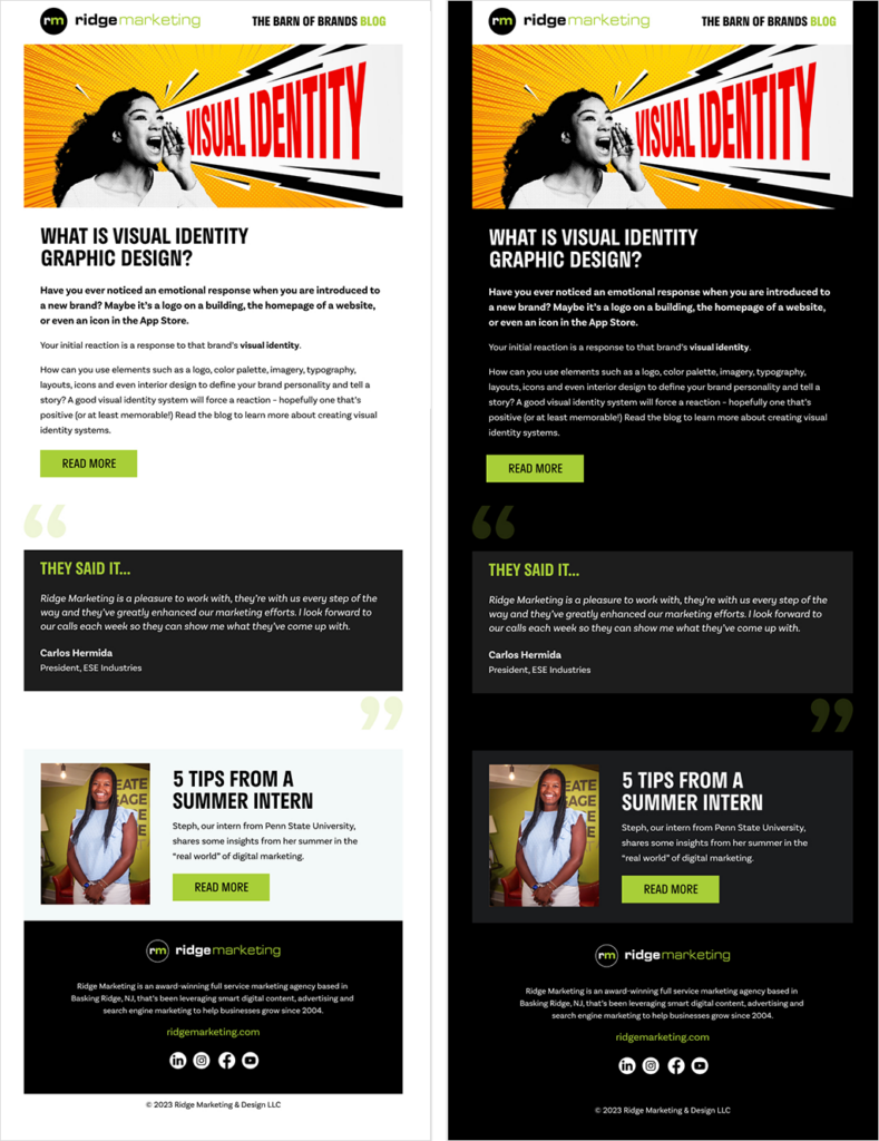
Let’s look at an email design as an example of how dark mode can impact your brand’s look and feel.
Default Dark Modes
Many email clients will force your email into a dark mode version if you have dark mode activated on your device
Email clients such as Outlook (for iOS) only detect and invert areas with light backgrounds so the light backgrounds are dark, while the dark text becomes light. This is a “partial invert” and results in a dark mode that looks like the example below.
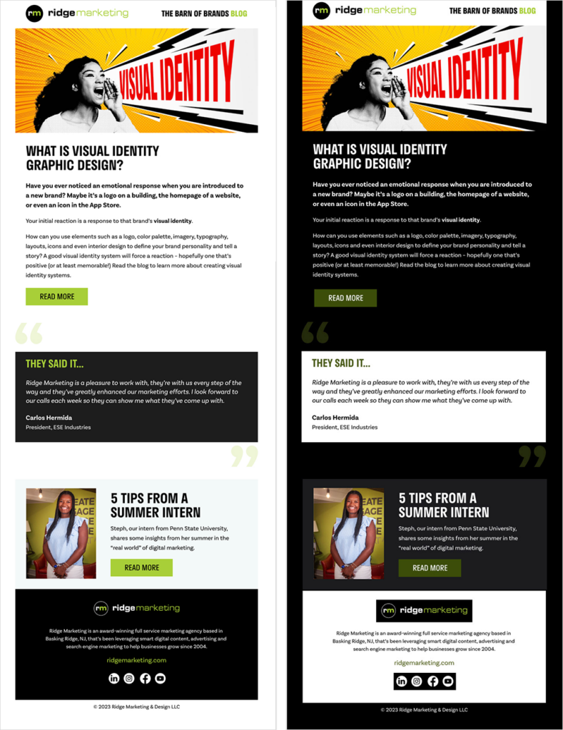
Other email clients, such as Gmail (iOS), Outlook (Windows), Office 365 (Windows), and Windows Mail, will automatically invert the areas with both light backgrounds and dark backgrounds. This is a “full invert” and results in a dark mode that radically changes the original email’s overall look without any control.
Custom Dark Mode
If it’s feasible and you’re not a fan of how the default dark mode looks, then a custom dark mode email may be best for your campaign. This allows more control over the overall look of how your email will appear in dark mode. The time-consuming part is designing and building your email twice – once for light mode and once for dark mode.
IS DARK MODE RIGHT FOR YOUR BRAND?
UX research shows that dark backgrounds enhance page contrast, making visuals pop and easier to focus on. If your brand is heavy on visual or graphic content, dark mode will allow users to retain more content faster and leave a stronger impression of what you offer.
- Does your brand communicate more visually or through text? Dark mode is excellent for enhancing emotional branding by emphasizing visual content but not so great for displaying big chunks of text. Light or white text on dark backgrounds can cause readability issues in practice, so for portions of your content that are or will be pretty text-heavy, dark mode or a dark aesthetic may not be the best choice.
- Do your brand’s colors work on a dark background? Avoid saturated colors, which can be hard to read on dark backgrounds. Make sure your contrast and color scheme meet the minimum accessibility standards.
- Do you have a lot of elements to communicate? Dark backgrounds can de-accentuate empty space, so limit the number of elements (icons, buttons, and small images) used together to avoid looking cluttered.
To summarize, your brand should work visually in both low-light and high-light environments, so a combination of dark mode elements and light option designs is the best choice for most brands.
Interested in learning more? Contact us if you want us to help take your brand to the next level.
Resources:
- https://eyeondesign.aiga.org/a-brief-history-of-dark-mode-from-the-matrix-like-displays-of-the-early-80s-to-today/
- https://www.wired.co.uk/article/dark-mode-chrome-android-ios-science/
- https://www.azcentral.com/story/money/business/tech/2023/07/10/dark-mode-light-mode-on-phone-screens/70393239007/
- https://www.litmus.com/blog/the-ultimate-guide-to-dark-mode-for-email-marketers/