


It’s Super Bowl week! The matchup is set and millions will be watching as the LA Rams and Cincinnati Bengals go toe to toe at Sofi Stadium for the NFL’s highest honor, winning the Lombardi Trophy. It appears the big game is also going to be downright more violent than ever before. At least, that’s what this year’s unintentionally grisly Super Bowl logo seems to imply.
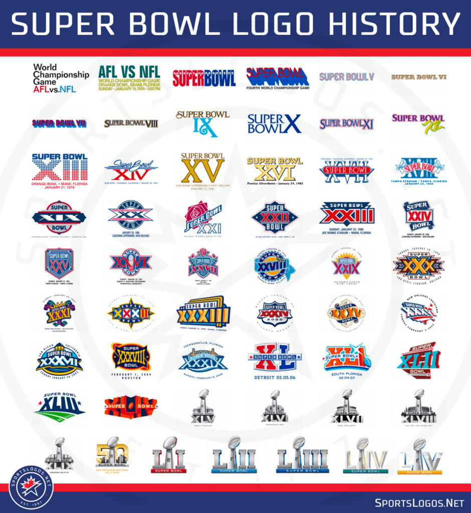
From 2011 through last year, the NFL abandoned its longtime tradition of commissioning unique and colorful Super Bowl logos that represented the city or venue in which the game itself was to be played. Instead, they went for simple, metallic treatments that looked as if the roman numerals had been made from the same shiny metal as the trophy itself. This style of logo would be repeated each year with only minor updates to include the new roman numerals and a model of the venue behind the trophy. The venue imagery was eliminated in 2017 in favor of a cleaner look with just the trophy, the roman numerals and a block of color behind the Super Bowl name. Not particularly memorable, the logos basically faded into the background each year.
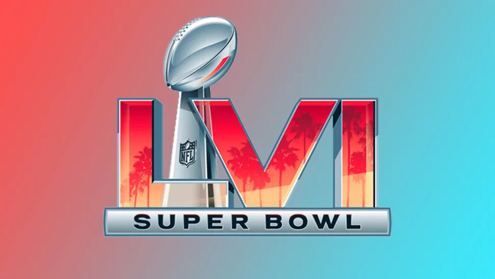
A Bloody Terrible Logo
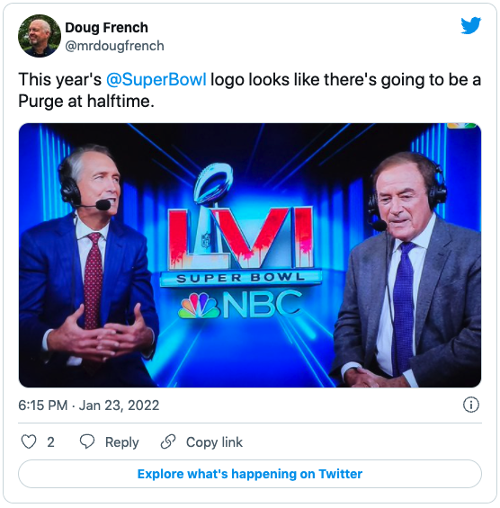
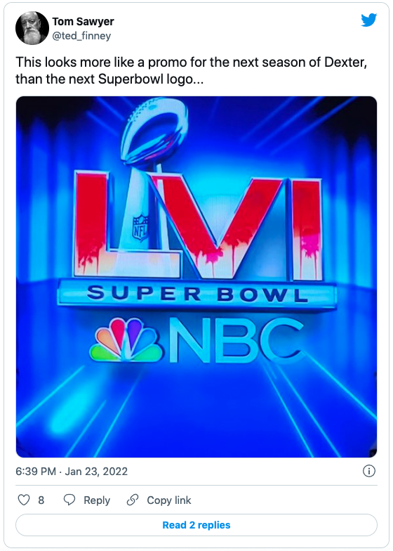
In attempt by the designers to bring a little of the old local flare back into the logo, however, they unintentionally made something eerily reminiscent of a grizzly crime scene. As you’d expect, fans dove all over this logo controversy on social. One Twitter user said the logo suggests “there’s going to be a Purge at halftime,“ and another thought it looked like a promo for an upcoming season of Dexter. Bestselling horror author Scott Sigler wondered if Freddy Krueger would be handling the coin toss.
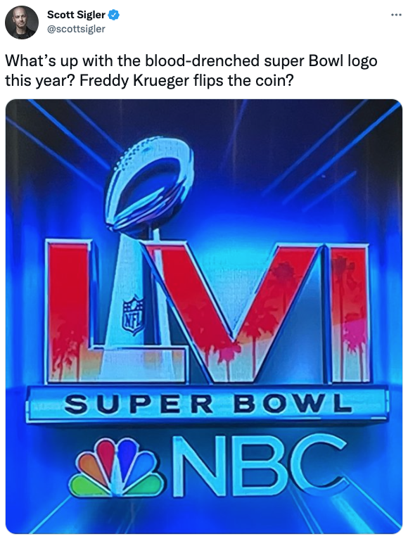
If you look closely at a crisp rendering of the logo, you can tell that it’s actually meant to depict silhouetted palm trees against the vivid and unique (smog enhanced though it may be) LA sunset.
So, what’s the issue? The ghastly confusion comes in when the logo is viewed at a distance or on screens with low resolution or limited color ranges. The position of the palm trees coupled with the red tones give it a look similar to a blood splatter. To make matters worse, the tree trunks look as if the “blood” is dripping down from the “splatter.”
Put Down the Knife and Back Away From That Logo
Sometimes it’s easy to forget one of the most fundamental steps in logo design is to step back and view your logo from a distance before committing to a design. (Squinting your eyes to make things slightly blurry is also effective.) It’s easy for designers and creative managers to get so far in the weeds that they become blind to aspects of a design that could appear confusing or problematic to the intended audience. Therefore, it’s equally important to show your logo design concepts to others who haven’t been as involved in the creative process.
If the visuals in your logo don’t hold up from a distance or make sense to others, or if there is even a 1% chance of your audience misconstruing the meaning in your logo, then it has to be adjusted accordingly. This is particularly true in today’s “judge first, ask questions later” social media culture.
The intent of your brand has to be clear to your audience. If it’s not, you could be in for a real blood bath.
Other Recent Logo Fails
While we’re at it, here are some other notable (and sometimes hilarious) logo fails that have made people scratch their heads.

The folks at Business Insider pointed out in 2012 that when Jenny Craig attempted to slim down their logo they unintentionally, as one commentor put it, made it look like “a chick left her name and phone number on a bar napkin.” Now that’s a crash and burn diet. After pushback from the public, wisely added “CRAIG” in thin capitals beneath the handwritten “jenny” for clarification.
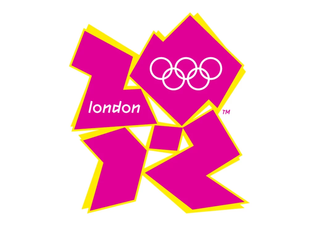
This logo for the summer Olympic games in London was not only confusing, it looked to some like a Simpson’s character was engaged in something dirty. The logo was so hated, in fact, that a petition to redesign it collected over 11,000 names. Game over.

It turns out that bloody bad logo decisions are not new. Sherwin Williams introduced this logo way back in 1906. At worst it appears as if they’re covering the entire planet with blood, and at best it looks like a really sloppy paint job. The true crime? They’re still using this logo today!
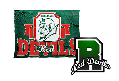
Speaking of paint, our beloved local high school here in Basking Ridge, NJ, competes under the “Red Devils” nickname. Except their teams dress entirely green. Huh? The name actually honors the Red Devil Paint company. Back in the late 50s its chairman, George Ludlow Lee Sr., donated the land that the high school now occupies. But the school didn’t want to be confused with its sister town of Bernardsville, who’s teams wear red. Thus, the “Red Devils who wear green” were born. We can’t really call this a logo fail, though. It’s more of a cool, quirky bit of local history.
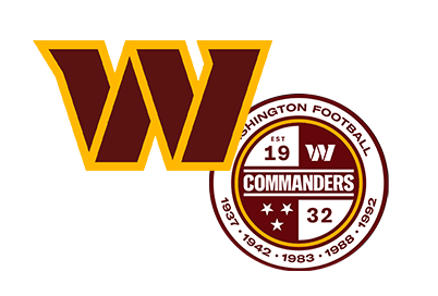
And since we have football on the brain at the moment, we’ll close with the new Washington Commanders logo. The overlapping sections of the W are meant to add depth while being reminiscent of a military stencil. That’s great, but all we see is the stand that prevents your tacos from falling over on Taco Tuesday. And aren’t people a little tired of being commanded by Washington at this point? Tweeeeeet! 10-yard penalty for bad branding.
Enjoy the game, everyone, and be on the lookout for other logo (and ad) fails. We hope you have a bloody good time.