


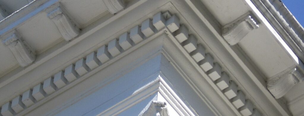
In ancient Greek architecture, small, rectangular blocks resembling “teeth” called dentils were placed beneath the soffit under the roof. Structurally they served no purpose outside of being decorative – so why were they there? It’s speculated that because temples in Greece were originally made of wood that these new buildings made of marble concerned and confused the public. To help people transition to marble structures and to feel safer, these dentils were meant to emulate the ends of wooden rafters so that people would see something in the buildings that looked and felt familiar to what they were used to.
This emulation of a material that creates a sense of familiarity is called skeuomorphism. Skeuomorphism is a system of design that may be deliberately employed to make something new look more familiar and comfortable. This has been used time and again to help society transition from one technological advancement to the next more easily – from ancient Greek architecture all the way to the mobile phone touchscreen. By having something new seem more familiar it helps to convince us that this new thing may not be as bad as we fear.
The Authenticity Of The Fake
The shift from analog to digital was one of the biggest technological transitions of our time. As we moved from gigantic, room-sized machines to small computers that could fit into our pockets it was a new challenge for designers to make this complex and powerful tech more intuitive for the average person to consume and understand. Designers discovered that computer interfaces would be much more intuitive to users if skeuomorphic design was applied.
In the digital age, skeuomorphic design is used to describe interface objects that mimic their real-world counterparts in how they appear and/or how the user can interact with them. Designers created digital equivalents of physical analog objects, also known as skeuomorphs.
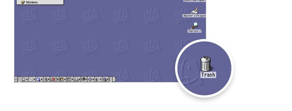
The “trash can” is, perhaps, the most recognizable skeuomorphic object. On computers the trash can icon let users drag stuff they didn’t want on their desktop to an actual bin. You could mimic the action of physically “moving” files (another real life equivalent).
Skeuomorphic design also lends itself well to allowing an object’s affordance to be easily interpreted. Affordances are an object’s properties that show the possible actions users can take with it, thereby suggesting how they may interact with that object based on its appearance. The characteristics of a button, for example, such as its 3D depth and shadows, make it look “turnable” or “pushable”.
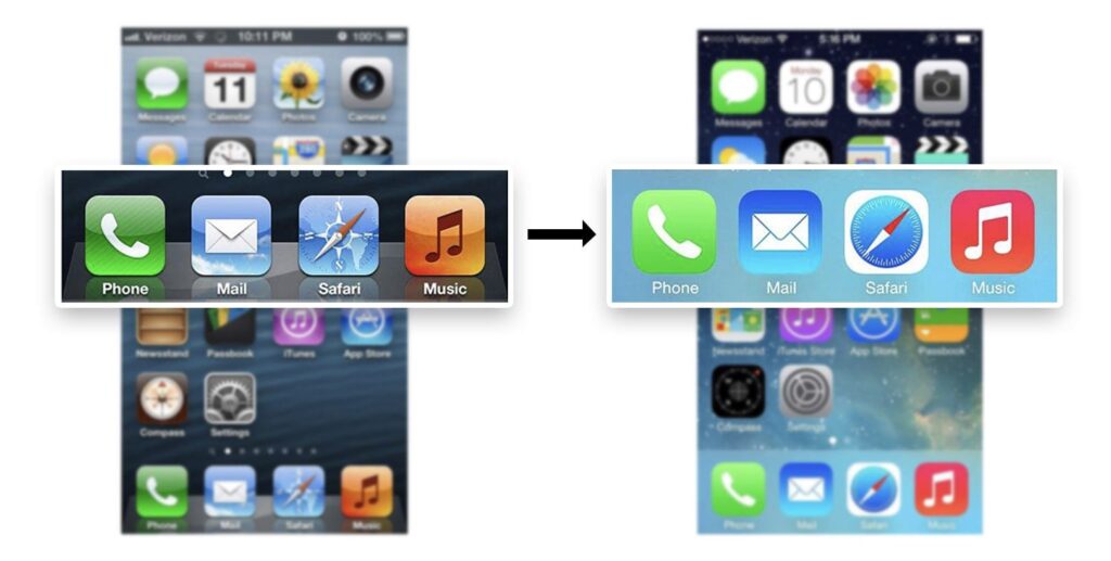
When the iPhone first debuted, the touchscreen was a new technology that suddenly became mass-consumed. In order to help transition people into using phones without physical buttons the designers decided to emulate buttons on the flat screens themselves. Icons were slightly shiny and beveled to look like real buttons, which helped users to intuitively understand they could press those shapes on a flat screen the same way they might press an actual physical button.

The Death Of Skeuomorphs And The Rise Of The Flat
By the late 2000s and mid 2010s users had become so accustomed to interacting with digital user interfaces that critics of skeuomorphic design considered it unnecessary. They argued that natural-looking objects made interfaces (which were now decreasing in size and available screen space) look cluttered and busy. Some of the objects depicted were now also obsolete and meaningless to users, such as a floppy disk icon representing the “save” action.
By 2013, we saw a new transition to flat design. The flat UI embraced the minimal interface trend and made everything look modern, sleek and less cluttered. Simple rectangles and squares in a fluid layout replaced those shiny, beveled buttons. There was no more depth or drop shadows, and shapes with gradients became very minimal. The introduction of Google’s Material Design helped to further confirm that flat design was where things were heading.

The Rebirth And Looking Ahead For 2020
Like every trend, though, flat design has run its course and we’re now seeing a switch back to a design aesthetic that looks and feels more nuanced and real.
For example, the bevel and chisel, an older design tool that harkens back to the days of early Photoshop 1.0, has made a comeback. By creating 3D forms out of hard lines, designers have figured out a way to merge flat design with classic skeuomorphism. Objects subtly mimic real-life objects, like beveled stone or raised buttons, by using flat colors and tight layering. Combined with subtle gradients and shadows the result is a tantalizingly touchable object in a sea of design currently dominated by flatness.
With new advancements in technology designers are also using skeuomorphism to further skew the lines between what we perceive as digital verses analog by having the digital object “interact” with the user.
For example, when the user presses what they perceive as a “button” on their screen, the object can visually sink down and give off the impression of being “pressed”. Other instances include objects that make a noise or respond with a vibration or feel that emulates what happens in the real world when the user interacts with familiar objects in the physical space.
Even though it faded from design for a time, skeuomorphs and skeuomorphism never truly went away. Today’s mobile devices still use the familiar shapes of physical objects to define simple tools – an analog telephone for phone calls, a point-and-shoot camera for photos, etcetera. Even though the shapes and colors have simplified overtime to remove details, the basic representation and familiarity of the objects we know are still the same. And as long as digital technology keeps moving forward and consumers are continually exposed to new tech they’ve never seen before, skeuomorphism doesn’t seem to be fading away anytime soon.