


Have you ever seen a logo and thought, “That looks so simple, I could have done that”? Well, you might be right. In theory, anyone with a pencil, paper and an idea can “design” a logo. The real question is, can you design a good logo? A logo that looks simple was designed to be just that. The process to make that logo simple, however, was not simple. At Ridge, our designers put in a tremendous amount of time and effort to design and execute a logo that will reflect your company’s value.
Let’s take a look at 5 specific aspects that make designing a logo especially challenging.
1. Deciding what typeface to use.
An important part of a logo’s job is to communicate a feeling that will resonate with an intended audience. Maybe you’re a firm that offers business advisory. You probably want to choose sophisticated serifs like Baskerville, Kepler, Didot, Caslon, Romana or others. Or maybe your business needs to reflect a unique ability or feeling. In that case you might want to use a custom font. As designers we have to do our due diligence and strive to find the right type treatment that will help your logo emerge from the crowd and put your business on the map.

2. Understanding the importance of logo placement.
Visibility is key to holding a place in the mind of the intended audience. Great care needs to go into thinking about who will see the logo, where they’ll see it and why

The who, where and why will go a long way in determining the overall look and feel of the logo, as well as how many alterations of a logo may be needed. A quality design that’s consistent will maximize your exposure without degrading the overall experience the audience has with your brand.
3. Standing out is hard, so your colors should be on point!
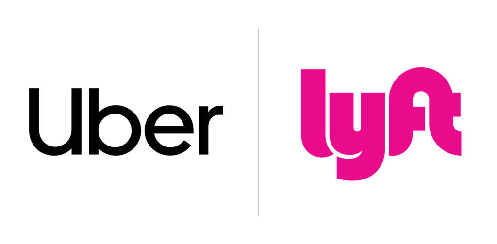
It can be really difficult to design a logo for a client who exists in a vastly populated industry. You want people to intuitively understand what the organization offers, but if you borrow too heavily from competitors it may signal that you’re a knock off with nothing new to bring to the table. Not to mention, it could get you into a bunch of legal trouble.
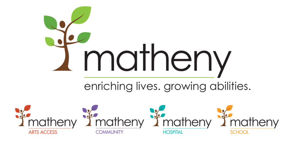
So, how to solve that problem? You need the right colors! Having the right colors can put you front and center without even speaking a word. Your brand’s colors can evoke a certain set of feelings, which is a part of the overall brand experience. However, you generally don’t want to use more than 1-3 colors in a logo, as it can be overwhelming and off-putting to the viewer.
4. Embrace context but don’t be too literal.
Symbolism is and will always be an important aspect of logo design. When used correctly, creatively, and subtly, we understand intuitively who the company is and what they do.
However, when logos have literal iconography inserted for the wrong reasons it can be extremely confusing to your audience. If you’re a sports team, use a mascot. If you’re a law firm…DO NOT HAVE A MASCOT. Bad design choices can confuse your audience.
These bad choices in logo design can be avoided if we just take a little time to think about context. Design elements in your logo should specifically call out attributes that will resonate with your audience. You can do this with symbolism that is creative, practical, productive and clear. Remember, logos need to engage your audience, not confuse them.

5. Try to keep preconceived notions and other influences out of the design.
Inherently, people tend to look to industry peers to see how they solved similar design problems. As designers, we often engage in this practice. Looking at other work for inspiration can help spark an idea that you can then use in our own way.
However, all design elements have to make good design sense. To put something into your design purely because it looks familiar and not because it will serve the unique needs of the project is not good design. It’s even worse if you downright copy another logo’s look and feel. All design elements in a logo should be original and reflect your business uniquely. Check out this video from Business Insider to see just how costly it can be when you take short cuts in logo design.
Business Insider: https://youtu.be/PfwB8EcyPwk
Imitation is the sincerest form of flattery. However, imitation is very different from plagiarism. As designers, we have to do our due diligence to make sure you don’t end up in a lawsuit.
Not so simple, huh?
From concept to creation and implementation, even the simplest logos are intrinsically complex. Logo design is an intricate process, and it takes a lot of time, study, communication and development to build a memorable brand. It’s my hope that in reading this you’re not only getting a small glimpse into what a designer has to consider, but you’re also gaining an understanding of the true value a logo can have. Getting it right for you and your business is crucial.
Are you in need of a new logo or maybe new branding overall?