


Whether you’re into web design or just want to print out your favorite photos from your phone, you’re likely aware of the all-too-common trend: The colors in your printout just don’t look quite right. So, why do the colors we see on our screens not translate to print?
First, let’s briefly talk about how color works
Colors are based off of how objects naturally reflect light waves. The surface of an object reflects some light waves and absorbs others, giving us its perceived “color”. An apple, therefore, is not inherently red. Rather, what we’re seeing is the apple absorb all the light waves and reflect the wavelength our eyes perceive as red.
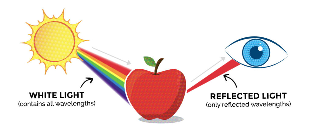
Light is a huge factor in how colors are viewed. Digital screens emit light, which is why colors on your monitor and phone will appear brighter and more vibrant. Your printer, however, uses dyes and pigments that don’t produce light but, absorb it—like that apple. This is why printed colors often look duller and less saturated then what you see on your screen.
RGB vs. CMYK – It matters
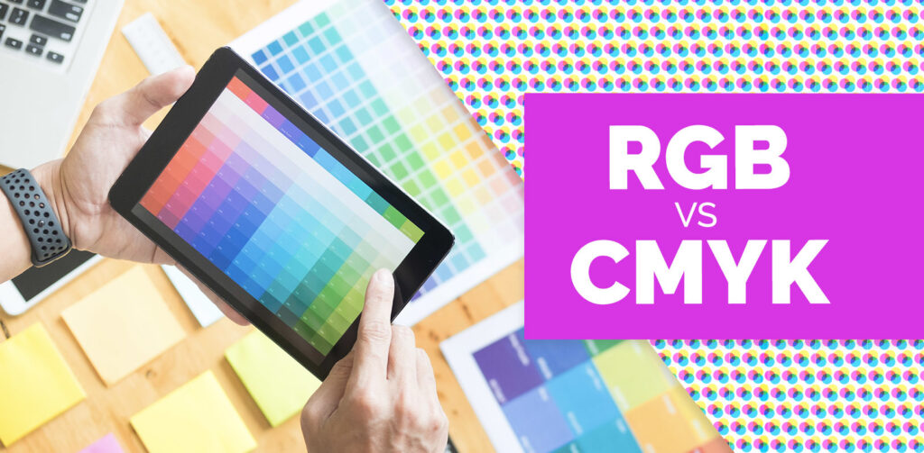
RGB
Red, green and blue (RBG) are the primary colors of the color spectrum. By varying the amount of red, green and blue light, all of the colors in the visible spectrum can be produced.
Digital screens use tiny dots called pixels that change colors along the RGB gamut. We use RGB for digital devices because combining red, green and blue lights produces lighter, brighter colors that can contrast against those dark digital screens.
CMYK
Your traditional color printer, however, uses cyan, magenta, yellow and black (CMYK). Combining these four inks together in varying amounts creates our colors.
Printers use CMYK because cyan, magenta and yellow will effectively cover most lighter color ranges for print. RGB simply can’t, and without the ability to emit light, red, green and blue, inks will always produce darker hues when combined. Using a CMYK color model provides a workaround for this problem as cyan, magenta and yellow are lighter than red, green and blue. This allows printers to produce lighter colors such as yellow or lime. Black (K) is added to help create darker colors and “true black” options that cyan, magenta and yellow can’t do alone.
What can you do to match color between screen and print?
Long story short, you can’t print light waves, so what you see on your screen may never perfectly match your printout. However, there are some ways to plan ahead and try to prevent this frustrating situation.
- Select the correct color setting from the start. CMYK is used for printing, while RGB is used for web. Converting colors often leads to issues with the colors changing hues and losing vibrancy, especially reds and blues.
- Remember that not all screens are created equal. Most computer monitors and mobile devices are manufactured to make pictures look as vivid and pretty as possible, which results in highly saturated and contrasted images with bright colors that cannot be produced on most printers. The age of your digital device, the brightness/color settings and retina display capabilities (the amount of pixels your screen can display at once) can also factor in to how the color is viewed.
- The paper matters. Your paper selection can have an enormous impact on how true colors reproduce in print. For example, glossy and textured papers absorb inks at different rates and can make a difference in the output of the final colors.
- If all else fails, select your colors from a Pantone Matching System (PMS). Pantone colors are used as an industry standard. While Pantone is the most accurate for print, they also provide RGB versions for many of their colors.
With these tips in mind, you’ll have a better chance of going from screen to print with a more accurate color palette.
RESOURCES: